Coincidentally I ran into a discussion on pie charts some weeks ago. Really, I had never thought about it. But there are many people who do not just advise not to use a pie chart, but in fact actively fight the use of it. Why is that? And should we all just agree?
A quick history lesson
The pie chart first appeared in 1801, in William Playfair’s Statistical Breviary, but started to be common somewhere in the mid 1900’s. Florence Nightingale used them quite often, which is why many people think she invented the pie chart. By the way, the bar chart is a bit older, and the first one we know also comes from Playfair. So, it has been around for some time, and in fact I think it is the first chart children learn to use in school. We are used to the pie, and why should there be a reason not to use them? The chart gives a clear overview of the breakdown of something into its smaller parts, and appears to do this in a way that has been acceptable for 200 years.
“Pie charts should never be used”
Among the most “militant” against the pie chart, we find Edward Tufte. Tufte is famous for his research and books on data visualization. In “The Visual Display of Quantitative Information” (Tufte, 1983) Tufte states:
“A table is nearly always better than a dumb pie chart; the only worse design than a pie chart is several of them, for then the viewer is asked to compare quantities located in spatial disarray both within and between charts […] Given their low density and failure to order numbers along a visual dimension, pie charts should never be used.”

 I must admit that I see some truth in this. A pie chart does not have a start, nor an end, and it is up to the person who creates the chart to decide which wedge comes where. In the pie chart on the left I guess you have to agree that it is virtually impossible to tell which one is the biggest. Replacing it by a simple bar chart, with the same data, immediately gives a clear image of the differences.
 And it gets worse…

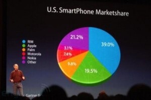
when we create a 3D version of the pie. A good example comes from Steve Jobs. If you look at the chart, it looks as if the (green) Apple part is the second biggest. In fact it is not, but it is almost impossible to see the difference between the “Other” (purple) and the “Apple” chunk, without looking at the labels. If Jobs had put this information in a bar chart, even without labels, it would have been very clear that Apple was the 3rd biggest at that time. Jobs presents you the Apple chunk, pushing it towards you. Had this been a real pie, presented to you on a birthday party, you probably would have chosen this part.
Should it stay or should it go?
So, are the people who advise to not use a pie chart right? I tend to say that this is for you to decide, I can only give you my opinion. I know I use them every now and again, because I sometimes think they add value, and people like them. And they clearly state that you are looking at a breakdown of a total. But since I read these articles I must admit that I think them over twice before using them.

