Update December 2017: TMNS is now Devoteam
Spotfire is very well equipped for self service Business Intelligence. Lots of people start working with it, and I just love that! So many people find out that it only takes a couple of hours training, either self-paced or in a classroom, to get started. I find that these users create beautiful and useful visuals.
That’s great news!
That’s great news indeed. Though, there are many things these new users don’t know yet. And one of the things I often come across is that they create multiple, almost identical visuals because they want to show:
- Actuals over time
- Budget over time
- Actuals and Budget over time
If you want to show this data separately, you need to make three visuals, right? Especially when you develop for web client users, since they cannot change the axes of the graph.
No need for that!
Did you know that it is possible to completely parametrise the axes of your visual? I’d like to tell you how to make only one visual, and be able to look at what you want to see: Actual, Budget or both.
But how?
Let’s review a very simple dataset, for example:
| MONTH | ACTUAL | BUDGET |
| JAN | 100 | 120 |
| FEB | 99 | 100 |
| MRT | 101 | 100 |
| APR | 103 | 95 |
| MEI | 105 | 100 |
| JUN | 106 | 95 |
| JUL | 104 | 105 |
| AUG | 99 | 110 |
| SEP | 98 | 100 |
| OKT | 98 | 100 |
| NOV | 94 | 95 |
| DEC | 101 | 110 |
1. Create the visuals
We pick this data and paste it into Spotfire. Now let’s create the visuals we are looking for:
2. Construct the selector
We created one graph for Actuals, one for Budget and one for Actuals and Budgets. Now we want to make one graph and a selector to tell the graph what to show: Actuals, Budget, or Actual and Budget. For that, we need to construct the selector. In order to do this, we need to create a small text area.
3. Create a property control
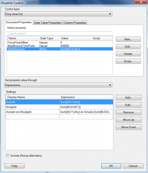
As shown in the preview below, we created a new Property, YAxisSelector. In the bottom part, by expression, we created three lines with corresponding Custom Expressions. When we save this, we will have a drop down where we can select the line(s) we would like to see.
4. Create the graph
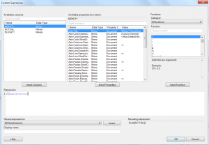
We deleted all but one of the graphs as we do not need them anymore. Now we are going to replace the value on the Y-Axis with the property we just created. Right click on the Y-Axis selector in the graph and select Custom Expression. In the custom expression we are going to pick up the property.
5. And we are done!
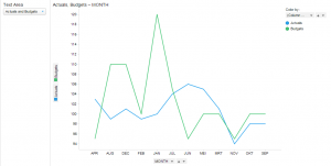
Click OK and it’s done. The Property Control now directs the Y-Axis of the graph!
Would you like to visit our next Spotfire event? Check out our Event page.
More about our TIBCO Spotfire Knowledge
Want to learn more about Spotfire through our client use cases, handy how-to articles and blog-posts? Click the button below to discover our knowledge.


